
Definition:
Value in art refers to how light or dark a color is. It is one of the fundamental elements of art and helps create contrast, depth, form, and mood in a piece of artwork.
Have you ever looked at a drawing that seemed almost 3D even though it was on a flat page? Or a painting that felt dramatic, soft, mysterious, or bright? The secret behind that visual magic often lies in one powerful element: value.
Whether you’re a beginner artist, an art student, or simply curious about art terminology, understanding what value means in art can completely transform how you see and create artwork.
Let’s break it down in a clear, friendly, and practical way.
What Is Value in Art?
In simple terms:
Value is the lightness or darkness of a color or tone in an artwork.
It ranges from pure white (lightest value) to pure black (darkest value), with many shades of gray in between.
Artists use value to:
- Create contrast
- Show form and volume
- Add depth and dimension
- Establish mood and atmosphere
- Direct the viewer’s eye
Even without color, value alone can make a powerful image. That’s why black-and-white photography and charcoal drawings can feel so realistic and dramatic.
The Origin of Value as an Art Concept
The concept of value has been studied and used for centuries. During the Renaissance, artists like Leonardo da Vinci explored light and shadow in depth. He developed techniques such as chiaroscuro, which uses strong contrasts between light and dark to create realistic volume.
Later artists continued refining value techniques:
- Rembrandt used deep shadows and glowing highlights.
- Caravaggio mastered dramatic lighting effects.
Today, value remains one of the seven elements of art, taught in classrooms worldwide.
Why Value Is So Important in Art
Many beginners focus heavily on color but experienced artists know something powerful:
👉 Value matters more than color.
You can remove color entirely and still have a strong artwork if the values are correct.
Here’s why value is essential:
- It creates the illusion of 3D form
- It separates foreground from background
- It enhances realism
- It strengthens composition
- It controls mood
For example:
- High contrast (very light + very dark) = Dramatic, bold, intense
- Low contrast (similar mid-tones) = Calm, soft, peaceful
Think of a horror movie scene vs. a sunny beach painting. The emotional difference often comes from value contrast.
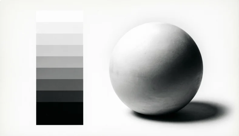
Understanding the Value Scale
Artists use something called a value scale to understand light and dark progression.
Basic Value Scale Example:
| Value Number | Description | Visual Tone |
| 1 | Pure White | Lightest |
| 2 | Very Light Gray | Soft highlight |
| 3 | Light Gray | Gentle light |
| 4 | Mid-Light Gray | Subtle tone |
| 5 | Medium Gray | Balanced mid-tone |
| 6 | Mid-Dark Gray | Gentle shadow |
| 7 | Dark Gray | Strong shadow |
| 8 | Very Dark Gray | Deep shadow |
| 9 | Pure Black | Darkest |
Artists use this scale to plan shading and ensure proper contrast.
How Artists Use Value in Real Artwork
1. Creating Form (Making Things Look 3D)
When light hits an object, it creates:
- Highlight (lightest area)
- Mid-tone (middle area)
- Shadow (dark area)
- Cast shadow (shadow on surface)
For example:
If you draw a sphere:
- The top where light hits = Light value
- The side away from light = Dark value
Without value changes, the sphere would look flat.
2. Creating Depth and Distance
Value helps create atmospheric perspective.
- Objects closer = Stronger contrast
- Objects farther away = Lighter, softer values
Look at landscapes. Mountains in the distance often appear lighter and hazier.
3. Creating Mood
Value controls emotional tone:
| Value Style | Emotional Impact |
| High Contrast | Dramatic, intense 😮 |
| Low Contrast | Calm, soft 😊 |
| Dark Overall | Mysterious, serious 🌑 |
| Light Overall | Cheerful, airy ☀️ |
Artists intentionally choose value patterns to shape the viewer’s feelings.
Value vs. Color: What’s the Difference?
Many people confuse value with color, but they are not the same.
| Term | Meaning |
| Value | Lightness or darkness of a color |
| Hue | The actual color (red, blue, green) |
| Saturation | Intensity or purity of a color |
For example:
- Light blue and dark blue have different values
- Blue and red have different hues
- Bright red and dull red have different saturation
Even bright yellow can have a dark value if mixed properly.
👉 Professional tip: Convert your artwork to black and white to check if your values are working correctly.
Types of Value in Art
1. High-Key Value
Mostly light tones
Example: Soft pastel portrait
2. Low-Key Value
Mostly dark tones
Example: Dramatic night scene
3. Full Value Range
Uses full spectrum from white to black
Example: Realistic charcoal portrait
Real-World Usage of Value
Value isn’t just for painters.
It’s used in:
- Photography
- Graphic design
- Film lighting
- Interior design
- Fashion styling
- Digital art
- Tattoo art
Even social media graphics rely heavily on strong value contrast for visibility.
Tone Examples: How Value Feels Emotionally
Let’s see how tone changes meaning.
Friendly Tone Example
A soft pencil sketch with light shading feels warm and welcoming 😊
Neutral Tone Example
Balanced mid-tones in a product photo look professional and clean.
Dramatic or Intense Tone Example
Deep shadows in a black-and-white portrait feel powerful and serious 😮
Value controls these impressions.
Alternate Meanings of “Value”
Outside of art, “value” can mean:
- Worth or importance (This painting has high value)
- Moral principles (Family values)
- Financial price (Market value)
But in visual art, it specifically means lightness and darkness.
Professional Alternatives or Related Terms
In art discussions, professionals may use:
- Tonal value
- Light and shadow
- Tonal contrast
- Value contrast
- Chiaroscuro (for dramatic light/dark use)
These are context-dependent but related to value concepts.
Common Mistakes Beginners Make with Value
- Using only mid-tones
- Avoiding deep shadows
- Not planning value structure first
- Relying too much on color
- Not checking artwork in grayscale
Correcting these improves artwork dramatically.
Practical Tips for Mastering Value
- Practice drawing with only black and white
- Create 5-step and 9-step value scales
- Study black-and-white photography
- Squint at your artwork to simplify values
- Use strong contrast for focal points
Value planning should happen early in the design process.
FAQ Section
1. What does value mean in art for beginners?
Value means how light or dark a color is. It helps make drawings look realistic and 3D.
2. Is value more important than color?
Yes, in many cases. Strong value structure makes artwork successful even without color.
3. How do you show value in drawing?
By shading using lighter and darker pencil pressure or different tones.
4. What is a value scale in art?
A value scale is a strip showing gradual changes from white to black.
5. Can color have different values?
Yes. Every color can be light or dark depending on how it is mixed.
6. What is high contrast in art?
High contrast means strong difference between light and dark areas.
7. Why does my drawing look flat?
It likely lacks strong value differences between highlights and shadows.
8. What is chiaroscuro?
Chiaroscuro is a technique that uses dramatic light and dark contrast to create depth.
Conclusion:
Understanding what value means in art is a game-changer for any artist.
To summarize:
- Value = lightness and darkness
- It creates depth, form, contrast, and mood
- It is more important than color in many situations
- Mastering value improves realism instantly
- Strong value contrast directs viewer attention
If you focus on value first, your artwork will automatically feel stronger and more professional.
Before adding color, ask yourself:
👉 Does my artwork work in black and white?
If yes you’re on the right track.

Justin Young is a passionate Digital Creator and Content Writer who specializes in crafting engaging, informative, and results-driven content. He focuses on creating high-quality, blog posts, and digital content that capture attention and deliver real value to readers. With a strong interest in storytelling, trends, and online growth, Justin helps brands and individuals connect with their audiences through clear, impactful, and creative writing.